Upload date
All time
Last hour
Today
This week
This month
This year
Type
All
Video
Channel
Playlist
Movie
Duration
Short (< 4 minutes)
Medium (4-20 minutes)
Long (> 20 minutes)
Sort by
Relevance
Rating
View count
Features
HD
Subtitles/CC
Creative Commons
3D
Live
4K
360°
VR180
HDR
598 results
Presented by Alisa Rod. This video is part of a series of lectures recorded to teach about basic data visualization concepts.
316 views
4 years ago
This tutorial delves into the foundational tools (e.g., Matplotlib, Seaborn, Pandas)for data visualization in Python. We'll explore bar ...
600 views
2 years ago
Introduction to network analysis and visualization with GEPHI. Datasets and tutorial here: ...
111,062 views
3 years ago
If you're fitting a curve or surface to data and want to ever use gradient-based optimizers or Newton solvers, make sure to do it in a ...
978 views
In this video, I dive deep into EEG waveform visualization and how we can make it more responsive. I explore the challenges of ...
128 views
1 year ago
Presented by David Christensen. This video is part of a series of lectures recorded to teach about basic data visualization ...
314 views
Hello everyone! In todays video I want to show you how you can use Obsidian for data visualization by using Obsidian Charts, ...
25,599 views
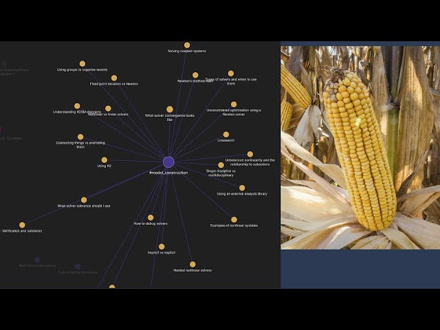
A system is converged when the residuals are close to 0 within a tolerance. How this is achieved depends on what solver you use, ...
1,227 views
167 views
Have you ever wondered how to group or categorise your SNOMED codes? You can use the Pathling Python library to call out to ...
627 views
Featuring Dr. Radovan Bast from UiT the Arctic University of Norway, this video is a part of the DocEnhance Course on Data ...
276 views
codanics #dataanalytics #pythonkachilla #pkc24 Python ka chilla 2024 You can now register for Python ka chilla 2024 This is a ...
5,833 views
In this video, I walk through the process of training a machine learning model using Python, specifically focusing on generating a ...
81 views
This series of videos is about visualizing data using ggplot and this video starts by introducing the basics of the ggplot2 package.
484 views
5 years ago
This segment demonstrates how to revise the input dataset to visualize proportion instead of count. It also covers adding labels to ...
1,173 views
Ever wondered who spends the MOST time on social media? In this video, we analyze a dataset of 62 users to uncover trends in ...
69 views
11 months ago
Welcome test reporting quickly episode and this episode will be looking at data visualization so today's quickly will be sticking to ...
166 views
Get ready for a shocking combination! In this video, we'll reveal the power of combining Matplotlib and Pandas in Jupyter ...
82 views
Python is a general purpose programming language and one of the most common tools in data science. For more on this topic ...
898 views
8 years ago
Full title: Revealing Room for Improvement in Accessibility within a Social Media Data Visualization Learning Community ...
330 views