Upload date
All time
Last hour
Today
This week
This month
This year
Type
All
Video
Channel
Playlist
Movie
Duration
Short (< 4 minutes)
Medium (4-20 minutes)
Long (> 20 minutes)
Sort by
Relevance
Rating
View count
Features
HD
Subtitles/CC
Creative Commons
3D
Live
4K
360°
VR180
HDR
53,874 results
In this video Rob, a Kaggle Grandmaster, quickly and humorously walks through each of the popular plotting and data ...
115,165 views
4 years ago
Turn raw data into clear visual insights with Python! In this hands-on tutorial, we complete five practical exercises using ...
224 views
3 weeks ago
Want to build powerful charts and graphs using Python? In this tutorial, you'll learn how to use Matplotlib, the most widely used ...
18 views
1 year ago
In this Python Data Visualization tutorial, learn all there is to know about data visualizations in Matplotlib, Seaborn and Bokeh.
72 views
3 years ago
In this tutorial, we will learn how to create charts in Python using the PyPlot library. We will be using Google Colab for Python ...
767 views
Master Python and Build Awesome AI Projects https://python-course-earlybird.framer.website/?&utm_source=pyvizdash ...
588,499 views
The tutorial will guide you how to create a countplot in Python. Data visualization provides an efficient way to understand the raw ...
293 views
Article: https://bit.ly/3VPXMTF Code: https://bit.ly/3WTeWRL Data: https://snap.stanford.edu/data/ego-Facebook.html Chapters: ...
25,762 views
In this Python Pandas tutorial, you will learn how to use Pandas to create chart visualization and table visualization using the plot() ...
66 views
Elevate Your Data Visualization Skills with 3D Plotting in Python! Learn how to craft captivating 3D visualizations using ...
386 views
2 years ago
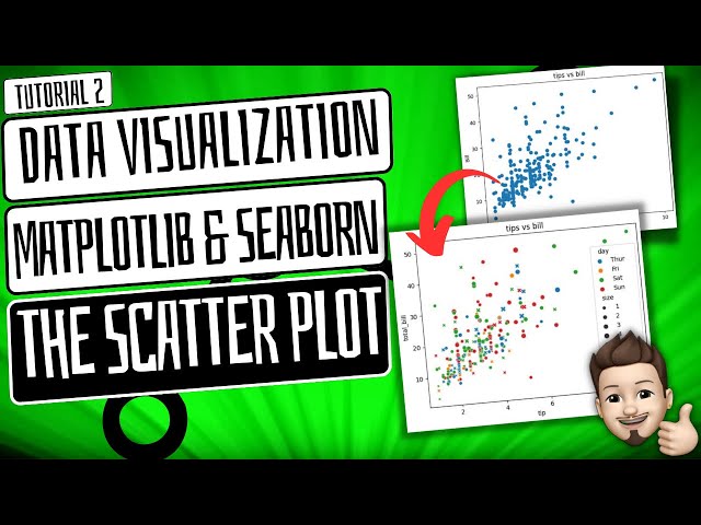
Mastering Data Visualization: Crafting Stunning Scatter Plots with Matplotlib and Seaborn! how to create a scatterplot ...
117 views
Welcome to 'Python for Data Science' course ! This video introduces the essentials of data visualization using the powerful ...
123,380 views
7 years ago
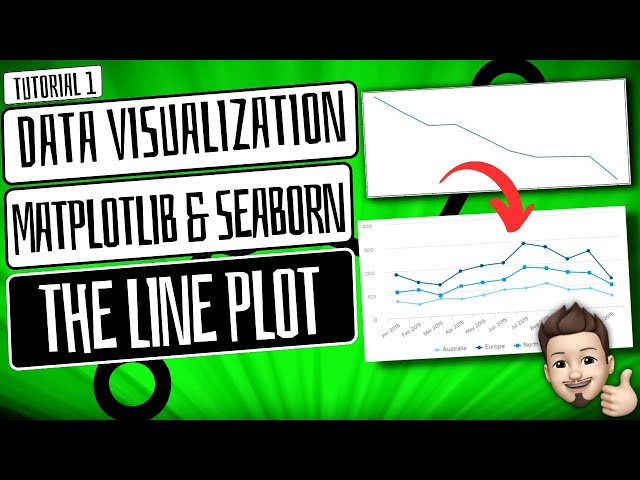
Mastering Data Visualization with Matplotlib and Seaborn: Creating Stunning Line Plots! Are you ready to bring your data to life ...
92 views
Thunder Talk by Reshama Shaikh at PyOhio 2021. Plotly is a versatile Python graphing library which lets us make interactive ...
1,502 views
5 years ago
Combining multiple charts in a single figure allows viewers to compare and contrast different datasets or aspects of a dataset ...
1,601 views
Creating line plots with Seaborn.
313 views
Mastering Data Visualization: Crafting Stunning Bar Plots with Matplotlib and Seaborn! how to create a barplot// barplot using ...
73 views
How to build interactive Python charts in Excel using Slicers to control interactivity and connected to data in Power Query. With this ...
59,792 views
box #programming #python In this video, it is informed that box plot is generated to assess the percentile of data distribution from ...
285 views
The video explains how to calculate basic statistics in Python. It covers the steps involved in importing libraries for statistical ...


![Learn Python Data Visualization with Matplotlib & Pandas on Colab [02/15]](/api/proxy/image?url=https%3A%2F%2Fi.ytimg.com%2Fvi%2FeAtkO-0Up_Q%2Fsddefault.jpg)



![Enriching Data Visualizations with Annotations in Plotly [PyOhio 2021]](/api/proxy/image?url=https%3A%2F%2Fi.ytimg.com%2Fvi%2FD2vsLy85rog%2Fsddefault.jpg)