Upload date
All time
Last hour
Today
This week
This month
This year
Type
All
Video
Channel
Playlist
Movie
Duration
Short (< 4 minutes)
Medium (4-20 minutes)
Long (> 20 minutes)
Sort by
Relevance
Rating
View count
Features
HD
Subtitles/CC
Creative Commons
3D
Live
4K
360°
VR180
HDR
92 results
Start writing CSS with confidence with my course CSS Demystified: https://cssdemystified.com When people find out about ...
34,594 views
1 year ago
Tired of manually adjusting font sizes for every device? In this video, I'll show you how to use CSS clamp() to create responsive ...
2,950 views
Limiting the total visible lines of text within an element is something I get asked about pretty frequently, and while there are ...
96,415 views
3 years ago
Checkout iCodeThis https://icodethis.com/?ref=kevin Links ✓ My finished version: ...
252,169 views
Simple Grid Layouts Cheatsheet: https://simple-grid-layout.kevinpowell.co/ Grid is often seen as useful for really large layouts that ...
147,910 views
2 years ago
Posibilidades de las funciones min(), max(), clamp() Introducción 0:00 Descripción ejemplo 1:12 Función min 2:20 Función max ...
1,933 views
5 years ago
Container queries are more than just a media query that looks at the parent, it also is aware of the font-size of the parent, which ...
53,100 views
Heue schauen wir uns mal die CSS3 Clamp() Funktion an und warum diese euer Leben deutlich einfach machen kann wenn ihr ...
39,630 views
4 years ago
Exploring what's coming next for fluidly responsive typography in CSS, and showing a couple ways you can support the same ...
487 views
New free course! Conquer Responsive Layouts: A 21-day challenge: ...
430,573 views
Igalia's Andreu Botella provides a quick update on the CSSWG's discussions and implementing line clamping in Blink as of late ...
52 views
Come and join my Discord Community! https://kevinpowell.co/discord Links ✓ My Discord: https://kevinpowell.co/discord ...
20,460 views
In this video, we dive into the world of React and explore the powerful text clamping feature that can enhance your application's ...
3 views
5 months ago
Pseudo-elements are super useful for creating decorative elements, but sometimes they can be a challenge to place where you ...
33,762 views
menu 0:00 intro 0:08 website section showcase 0:16 website section responsive showcase 00:28 html code 00:36 html code ...
68 views
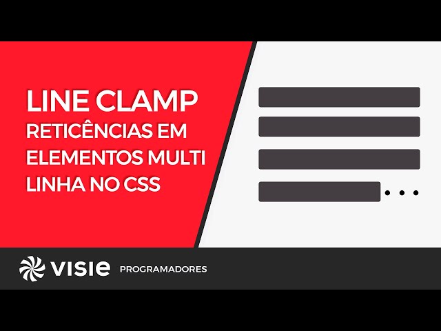
Todo mundo que já usou text-overflow: ellipsis se fez a mesma pergunta: é possível fazer isso com uma caixa de texto, com mais ...
440 views
💡 Learn how to transform your websites with modern and responsive typography using CSS! In this complete tutorial 🎥, I guide ...
889 views
In this video, I am going to talk about tips that can help you create a Responsive Website with ease. Additionally, I've written an ...
2,512 views
Link to podcast → https://goo.gle/3ZVnB8z In this episode we tackle one of the most asked questions of all CSS history.. how do I ...
8,237 views
In this video I'll show you one way you can write 100% valid CSS that contains custom at-rules you can read and work with using ...
2,003 views
7 years ago


![CSS. Funciones min(), max(), clamp() [13]](/api/proxy/image?url=https%3A%2F%2Fi.ytimg.com%2Fvi%2FvQTmSWazEtA%2Fsddefault.jpg)

![Neuer BOOSTER für euere Responsive oder Fluid Layouts mit CSS Clamp() Function! [TUTORIAL]](/api/proxy/image?url=https%3A%2F%2Fi.ytimg.com%2Fvi%2FCte0oYy9kYY%2Fsddefault.jpg)