Upload date
All time
Last hour
Today
This week
This month
This year
Type
All
Video
Channel
Playlist
Movie
Duration
Short (< 4 minutes)
Medium (4-20 minutes)
Long (> 20 minutes)
Sort by
Relevance
Rating
View count
Features
HD
Subtitles/CC
Creative Commons
3D
Live
4K
360°
VR180
HDR
75,547 results
Colab Notebook: https://colab.research.google.com/drive/1wxI23X7EzV2-DlWU7F0iIeTSTV2OPYTy?usp=sharing Thank you for ...
37,226 views
4 years ago
Here are some resources that have helped me: 1. Docs - https://plotly.com/python/getting-started/ 2. Great github repo ...
15,770 views
Tired of Matplotlib's outdated approach? Discover these 5 powerful Python libraries that offer cleaner, more intuitive, and often ...
8,075 views
1 year ago
Data visualization is an import part of working with data and Python has many libraries that allow you to display a wide range of ...
8,081 views
Data visualization is an important part of working with data and Python has many libraries that allow you to display a wide range of ...
11,487 views
In this video Rob, a Kaggle Grandmaster, quickly and humorously walks through each of the popular plotting and data ...
109,086 views
Learn the quickest way to build a Python Dashboard with ChatGPT Plotly and Dash. We'll show you two separate dashboards, ...
74,932 views
2 years ago
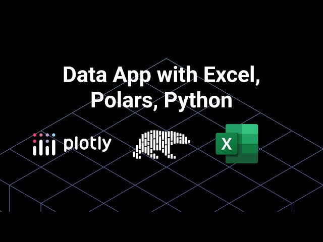
In this new walkthrough, we explore how to use the blazing-fast Polars dataframe library in a Dash app, featuring a dynamic Excel ...
348 views
3 months ago
In this chapter, you'll understand what Plotly is, why it's widely used for interactive data visualization, and how to install and set it ...
75 views
Hello Everyone! Today, in this video, I am going to step-by-step guide you on How to install Plotly with the latest Python on ...
259 views
2 months ago
Data Used: https://www.nasdaq.com/market-activity/stocks/aapl/historical Google Colab Link: https://colab.research.google.com/ ...
9,358 views
An intro to plotly Dash in Python with a real-world dataset example. Build interactive, nice-looking, easily sharable, and ...
79,736 views
5 years ago
A Sankey diagram or a Alluvial diagram is a visualization used to depict a flow from one set of values to another. This video is a ...
26,046 views
3 years ago
A tutorial on the creation of two Plotly Dash apps with the DBRX LLM. The first app is a simple chat app, with Plotly Dash serving ...
2,985 views
Explore All My Excel Solutions: https://pythonandvba.com/solutions DESCRIPTION ...
12,117 views
Plotly Ultimate Guide For Beginners The video presents basic usage of Plotly library for creating interactive charts in Python.
168 views
Plotly is a Data Visualization library. It is actually written in JavaScript but in this video series, we are going to use a python ...
880 views
Create a multi page app in Python using Plotly Dash. This is an introduction to multi-page Python Apps, focused on getting you ...
30,691 views
pro.gvol.io Tutorial Code: https://github.com/genesis-volatility/python-tutorial Plotly with Pandas: ...
498 views
An overview of the Dash web application framework. Dash enables python data analysts to build and deploy rich web applications ...
188,395 views
8 years ago
Learn to build an interactive app with matplotlib graphs, dropdowns and tables with Plotly Dash.
15,488 views
Learn to deploy your Dash data app to the web, using Render for no cost. Follow and connect with the video creator, Pierre-Olivier ...
38,286 views
This tutorial is an introduction to Sunburst charts on Plotly Express. Plotly Express is a data visualizaiton library in Python that ...
1,888 views
In this video tutorial, I'm going to walk you through how to make a simple plotly dash web app for visualizing covid case counts in ...
3,116 views
This is a First introductory plotly tutorial video of plotly data visualization in python with real data, I have talked about how you can ...
39,403 views
7 years ago


![How to Install Plotly with latest Python on Windows 10/11 [ 2025 Update ] Plotly Tutorial](/api/proxy/image?url=https%3A%2F%2Fi.ytimg.com%2Fvi%2FSmoaSXEZgYA%2Fsddefault.jpg)


![📈 How To Create A Candlestick Chart In Python Using Plotly | Tutorial [EASY]](/api/proxy/image?url=https%3A%2F%2Fi.ytimg.com%2Fvi%2Fc1zwV8x-zK4%2Fsddefault.jpg)


