Upload date
All time
Last hour
Today
This week
This month
This year
Type
All
Video
Channel
Playlist
Movie
Duration
Short (< 4 minutes)
Medium (4-20 minutes)
Long (> 20 minutes)
Sort by
Relevance
Rating
View count
Features
HD
Subtitles/CC
Creative Commons
3D
Live
4K
360°
VR180
HDR
1,552,200 results
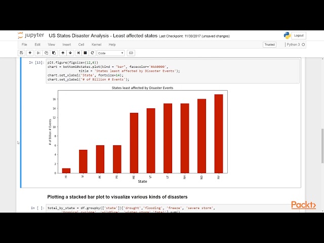
In this video, I will show you how you can represent the data in different visual contexts, patterns, etc on Jupyter Notebook using ...
149,440 views
6 years ago
In this video Rob, a Kaggle Grandmaster, quickly and humorously walks through each of the popular plotting and data ...
114,942 views
4 years ago
In this video, I will show you how you can represent the data in different visual contexts, patterns, etc. Data visualization is the ...
3,231 views
Here you will learn 9 Python Data Visualization Examples in Python. » Make sure you subscribe to the channel if you haven't: ...
4,424 views
5 years ago
Turn raw data into clear visual insights with Python! In this hands-on tutorial, we complete five practical exercises using ...
215 views
2 weeks ago
Colab Notebook: https://colab.research.google.com/drive/1wxI23X7EzV2-DlWU7F0iIeTSTV2OPYTy?usp=sharing Thank you for ...
42,065 views
A Python tutorial for beginners to create interactive data visualization and charts using plotly or plotly.px. In this Python tutorial for ...
312 views
3 years ago
In this video, we learn how to create bar charts using Python, step by step, with five clear and practical examples. Bar charts are ...
176 views
2 months ago
Learn how to use Plotly in Python to create interactive visualizations for data analysis, dashboards, and scientific research.
303 views
8 months ago
In this video series, we will learn Python Programming using Pandas Data frame, Matplotlibrary, and the Plotly Dash to build ...
187 views
This playlist/video has been uploaded for Marketing purposes and contains only selective videos. For the entire video course and ...
3,450 views
8 years ago
Learn how to create amazing interactive data visualizations with Bokeh in Python! Demonstration: ...
1,486 views
7 years ago
Analyze Student Performance by Using Seaborn and Matplotlib (Python) Support me to make more videos: ...
825 views
Learn how to create stunning and insightful data visualizations using Python libraries like Matplotlib, Seaborn, and Plotly!
835 views
Job Data App https://datanerd.tech/ Python For Everybody https://lukeb.co/PythonForEverybody Python for Data ...
478,183 views
In this tutorial, we will learn how to create charts in Python using the PyPlot library. We will be using Google Colab for Python ...
761 views
In this Python Data Visualization tutorial, learn all there is to know about data visualizations in Matplotlib, Seaborn and Bokeh.
72 views
talking about main Python visualization libraries, explaining when to use them and their pros and cons Hello! In this video I am ...
923 views
Let's look at the art of visualizing data. How do you make eye catching visuals while keeping them easy to consume and ...
15,902 views
... Tableau Data Visualization - https://coursera.pxf.io/MXYqaN Udemy Courses: Python for Data Analysis and Visualization- ...
128,932 views




![Learn Python Data Visualization with Matplotlib & Pandas on Colab [02/15]](/api/proxy/image?url=https%3A%2F%2Fi.ytimg.com%2Fvi%2FeAtkO-0Up_Q%2Fsddefault.jpg)