Upload date
All time
Last hour
Today
This week
This month
This year
Type
All
Video
Channel
Playlist
Movie
Duration
Short (< 4 minutes)
Medium (4-20 minutes)
Long (> 20 minutes)
Sort by
Relevance
Rating
View count
Features
HD
Subtitles/CC
Creative Commons
3D
Live
4K
360°
VR180
HDR
157 results
Get the transcript and subscribe to receive all episodes right at: https://philosophylectures.substack.com/ You might also be ...
50 views
3w ago
Learn Seaborn for creating powerful statistical visualizations and understand Python loops for repeating tasks efficiently. Explore ...
6 views
14h ago
In Day 23, learn Matplotlib in Python and create powerful visualizations using Line Plots, Bar Charts, and Scatter Plots.
123 views
Streamed 5d ago
matplotlib lecture 6 | matplotlib bar plot | horizontal bar plot matplotlib | multiple bar plot matplotlib | stacked bar plot matplotlib ...
62 views
2w ago
In this episode, we move from simple chart examples to real-world data visualization using Pandas and Matplotlib. Learn Python ...
220 views
3d ago
Data Visualization with Matplotlib | Creating line plot | Labeling axes,Legends & Interpretation In this One Shot Lecture, we cover ...
531 views
2d ago
DATA VISUALIZATION USING MATPLOTLIB — PART 2 Welcome to SK DataLabs! In this lecture, we continue our journey into ...
39 views
5d ago
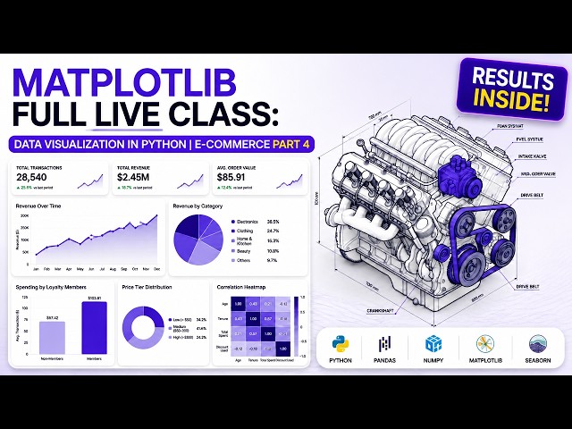
Data visualization in Python with Matplotlib - Part 4 of The E-Commerce Data Playbook. In this recorded live class, a Learnbay ...
227 views
matplotlib | matplotlib tutorial | matplotlib course | matplotlib tutorial in hindi | matplotlib in hindi | python matplotlib | python ...
579 views
Learn how to create and customize professional Line Charts in Python using Matplotlib. In this practical lesson, you will ...
51 views
11d ago
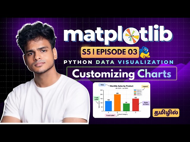
In this Matplotlib Tutorial in Tamil, we'll learn how to transform a basic chart into a clear, professional and easy-to-understand data ...
483 views
4d ago
#Seaborn #Python #DataVisualization #DataAnalysis #PythonForDataScience #SeabornTutorial #RelationalPlots #LinePlot ...
223 views
12d ago
Matplotlib Subplot, subplots() & Boxplot() in Python | Data Visualization Tutorial #06 Learn **Matplotlib Subplot, subplots(), and ...
77 views
... and axes ✓ Practical data visualization examples Learn Matplotlib step-by-step and build a strong foundation in Python Data ...
266 views
If you are learning Python, Data Science, Data Analytics, Machine Learning, or Data Visualization, this Seaborn series will help ...
182 views
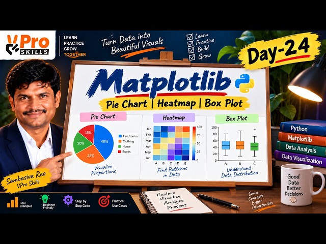
In Day 24, learn how to create Pie Charts, Heatmaps, and Box Plots using Matplotlib with simple practical examples. Understand ...
107 views
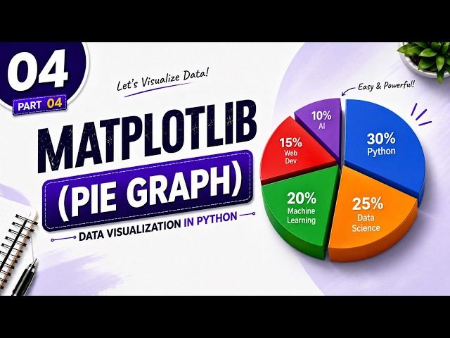
Learn how to create and customize a **Pie Chart in Python using Matplotlib** In this **Matplotlib Tutorial #04**, you will learn ...
43 views
4w ago
Learn Matplotlib Pie Charts and Histograms in Python with this practical Data Science lesson. In this tutorial, you will learn ...
67 views
... seaborn data visualization | data visualization python | python data visualization | python for data science | data science python ...
87 views
9d ago
A beautiful chart can still tell the wrong story. Learn how to spot misleading graphs, choose better alternatives, and check the data ...
12 views
16h ago