Upload date
All time
Last hour
Today
This week
This month
This year
Type
All
Video
Channel
Playlist
Movie
Duration
Short (< 4 minutes)
Medium (4-20 minutes)
Long (> 20 minutes)
Sort by
Relevance
Rating
View count
Features
HD
Subtitles/CC
Creative Commons
3D
Live
4K
360°
VR180
HDR
156 results
BIDS Data Science Lecture Series | September 4, 2015 | 1:00-2:30 p.m. | 190 Doe Library, UC Berkeley Speaker: Nathaniel Smith, ...
1,941 views
Streamed 10 years ago
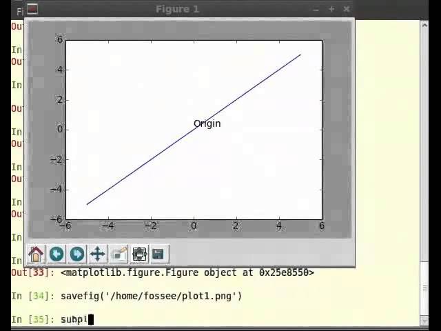
... the coordinate systems um that matplotlib has if we're going to be basing our work on matplotlib and so here i have um a tutorial ...
396 views
5 years ago
Python is a high-level programming language that is leveraged in a wide range of disciplines and fields. This webinar training ...
139 views
4 years ago
Week 4: Tutorial 04 Part 01: Plotting In 1 D Using Python.
1,171 views
3 years ago
Multiple plots overlays linspace give one with very few points, more points show smoothness of the curve legend figure 1, figure2 ...
4,205 views
11 years ago
... towards my ultimate goal of making the venn diagram i need to somehow get these on a matplotlib area and so you can see i've ...
451 views
This lesson expands on the optogenetic spike train data we worked with in the previous chapter. Now we have data recorded from ...
527 views
Seaborn is a great plotting package for Data Science in Python. It allows you to easily generate common kinds of plots that help ...
790 views
Automating Reports from CSV using Python libraries ('docxtpl', 'docx2pdf') and 'Matplotlib'. Python 'docxtpl' and 'docx2pdf' ...
536 views
1 year ago
59 views
00:00:00 - Using Huggingface 00:03:24 - Finetuning pretrained model 00:05:14 - ULMFit 00:09:15 - Transformer 00:10:52 - Zeiler ...
119,282 views
This video is the first of three parts of a programming tutorial on using Python for data analysis of small-angle scattering ...
147 views
This video is the second of three parts of a programming tutorial on using Python for data analysis of small-angle scattering ...
72 views
... sequence of x y coordinates which is a little bit different than how we've done with map uh matplotlib right with matplotlib if i was ...
574 views
This videos is for week 4 of Intro to Programming at Adelphi University 2024. We look at plotting US Census data for large cities in ...
205 views
Generating figures is part of the scientific process. This should not be manual, but ideally they should be automatically generated ...
135 views
2 years ago
Week 12: Lecture 59: Generating random samples using Python, Hypothesis Testing using Python.
587 views
296 views
Onboarding video for preparing Carpentries Instructors to teach the Data Carpentry Foundations of Astronomical Data Science ...
384 views
Week 4: Tutorial 04 Part 02: Plotting In 2 D Using Python.
798 views