Upload date
All time
Last hour
Today
This week
This month
This year
Type
All
Video
Channel
Playlist
Movie
Duration
Short (< 4 minutes)
Medium (4-20 minutes)
Long (> 20 minutes)
Sort by
Relevance
Rating
View count
Features
HD
Subtitles/CC
Creative Commons
3D
Live
4K
360°
VR180
HDR
352 results
In this video, you'll learn how to change the color palette in your Matplotlib charts—a simple way to improve the aesthetics ...
24 views
7 days ago
How to Create Gridlines in Python Plots Matplotlib Guide In this video, you will learn how to create gridlines in Python using ...
42 views
5 days ago
FREE EXCLUSIVE WORKSHOP ALERT! CLICK HERE TO JOIN THE MEETING FOR FREE: ...
21 views
15 hours ago
Bring your scientific data to life with animated visualizations! Learn how to create professional animations in Python using ...
0 views
2 days ago
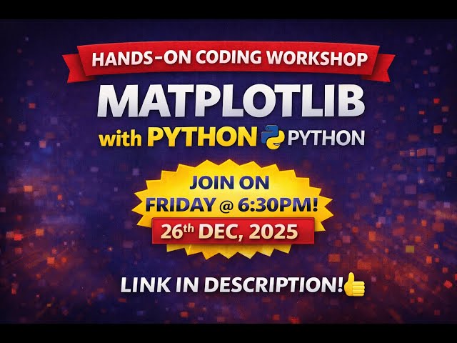
Welcome to the Matplotlib Hands-On Coding Workshop! In this session, we will learn data visualization from scratch using Python ...
10 views
Learn how to create stunning hand-drawn sketch style plots in Matplotlib that make your research figures stand out!
If you want to break into data analytics or strengthen your existing skills, this Data Analytics Full Course FREE by Intellipaat, ...
5,842 views
Streamed 10 hours ago
In this video, you'll learn how to visualize programming language popularity trends using Python and Matplotlib. We plot ranking ...
4 days ago
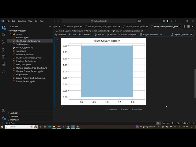
How to Create a Filled Square Pattern in Python Using Matplotlib In this video, you will learn how to create a filled square pattern ...
28 views
sayyednasarali #DataVisualization #Python #Matplotlib #Seaborn #DataScience #BeginnerPython #SchoolLevel #PythonTutorial ...
47 views
6 days ago
... numpy tutorial, pandas tutorial, matplotlib tutorial, data science crash course, learn data science fast, python for data analysis, ...
46 views
In this Data Analytics full course, you'll begin with Python basics and progress through NumPy arrays, Pandas operations, and ...
1,800 views
18 hours ago
In this video, you'll learn how to create contour line plots in Python using NumPy and Matplotlib. Contour plots are commonly used ...
Welcome to Part 1 of our Data Visualization with Matplotlib series! In this video, we will understand what data visualization is, why ...
12 views
In this video, we dive into a common issue faced by many data visualizers using Matplotlib: the 'tight' axis not functioning as ...
1 view
3 days ago
Online CBSE Tuition & Doubt Clarification Sessions for Class 11 & 12 – Computer Science & Informatics Practices Contact: ...
Get started with data analysis in Python using Jupyter Notebook! This tutorial introduces essential libraries — NumPy, pandas, ...
sample code: https://github.com/mhe931/ml4cv These educational documents introduce the fundamentals of image processing ...
11 views
In this video i have used python with matplotlib and numpy library to illustrate beautiful geometric animation. #python #panda ...
How to Do Data Visualization in Python (easy Method) | Surfshark VPN Deal — Stay private and secure. $1.99/mo + 3 Months ...