ViewTube

ViewTube
Sign inSign upSubscriptions
Filters

Upload date

Type

Duration

Sort by

Features

Reset

2,382 results

Dr. Simulate
How to visualize computational mechanics: Matplotlib, Manim, and Blender

This is a talk that I gave at WCCM-ECCOMAS 2026 in Munich, in which I demonstrate different software tools for creating ...

18:29
How to visualize computational mechanics: Matplotlib, Manim, and Blender

2,184 views

1 day ago

Obiwan Academy
Create Your First Python Charts with Matplotlib

Matplotlib is a core tool in the data science toolkit. It is the most developed and widely used plotting package in Python.

21:42
Create Your First Python Charts with Matplotlib

10 views

11 days ago

EFrimpong and The Math Monster
Introduction to Data Visualization with Python

Learn the fundamentals of Data Visualization with Python in this beginner-friendly tutorial. Discover how to create insightful charts ...

5:27
Introduction to Data Visualization with Python

48 views

2 weeks ago

VPro Skills
Matplotlib Tutorial for Beginners | Line, Bar, Histogram & Subplots | Python Data Visualization

Learn Matplotlib from Scratch with Practical Examples! In this session, you'll master Matplotlib, the most popular Python library for ...

1:18:35
Matplotlib Tutorial for Beginners | Line, Bar, Histogram & Subplots | Python Data Visualization

22 views

3 weeks ago

Dystlab
Interactive Engineering Documentation: Bridging Python (Matplotlib) and TechEditor

When building technical reports or educational materials, static plots often fall short. They force the reader to mentally visualize ...

2:55
Interactive Engineering Documentation: Bridging Python (Matplotlib) and TechEditor

40 views

12 days ago

CodeWayLabs
Python Matplotlib Project | Petrol Price Analysis (1990–2008) with Pandas

Welcome to Part 3 of the Matplotlib Full Course! In this practical tutorial, you'll learn how to work with real-world datasets by ...

10:47
Python Matplotlib Project | Petrol Price Analysis (1990–2008) with Pandas

2 views

5 days ago

Data Guru Akash
Matplotlib plot customisation: Style your charts like a pro | Stop making ugly python charts!

welcome to lecture 19 of our complete python, data science, and machine learning series! in the last video, we learned the ...

12:29
Matplotlib plot customisation: Style your charts like a pro | Stop making ugly python charts!

43 views

2 weeks ago

Obiwan Academy
How to Create Contour and 3D Surface Plots in Python with Matplotlib

You will learn how to: - Create coordinate grids with NumPy - Visualize values using contour lines and colors - Add a color bar to ...

15:09
How to Create Contour and 3D Surface Plots in Python with Matplotlib

17 views

10 days ago

learnwithvasanth
Day 9 - Matplotlib Complete Tutorial | Data Visualization in Python for Data Science & AI

Matplotlib – Complete Tutorial for Data Science & AI In this video, you will learn Matplotlib, the most popular Python library for data ...

20:02
Day 9 - Matplotlib Complete Tutorial | Data Visualization in Python for Data Science & AI

11 views

11 days ago

Dr Tahir Dogar
Topic 70 | Matplotlib Figure Anatomy & Visualization Workflow

This topic explains the structure of Matplotlib figures, including Figure, Axes, and Axis, and compares stateful versus object ...

8:25
Topic 70 | Matplotlib Figure Anatomy & Visualization Workflow

27 views

2 weeks ago

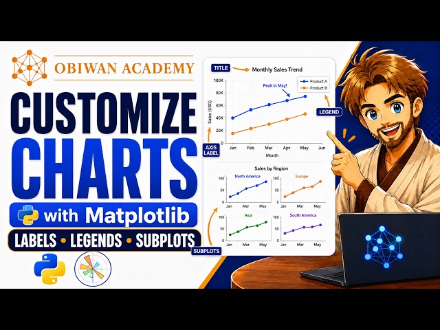
Obiwan Academy
How to Customize Python Charts with Matplotlib: Labels, Legends, Subplots & More

Matplotlib is a core tool in your data science toolkit. It is the most developed and widely used plotting package in Python.

28:14
How to Customize Python Charts with Matplotlib: Labels, Legends, Subplots & More

14 views

11 days ago

Data Guru Akash
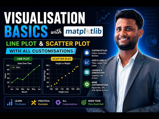
Master Python Data Visualisation: Matplotlib tutorial for beginners | custom line & scatter plots!

welcome to lecture 18 of our complete python, data science, and machine learning series! raw dataframes are great, but the ...

18:25
Master Python Data Visualisation: Matplotlib tutorial for beginners | custom line & scatter plots!

96 views

3 weeks ago

VPro Skills
Matplotlib Tutorial for Beginners | Line, Bar, Histogram & Subplots | Python Data Visualization-2

Learn Advanced Matplotlib with practical coding examples! This session continues our complete Python & Data Science series ...

1:39:57
Matplotlib Tutorial for Beginners | Line, Bar, Histogram & Subplots | Python Data Visualization-2

23 views

3 weeks ago

Shubham Patra
Master Data Visualization in Python: Build a Professional Portfolio (Matplotlib, Seaborn, Folium)

Master the art of Data Visualization with Python! In this tutorial, I demonstrate how to transform raw data into powerful, professional ...

12:09
Master Data Visualization in Python: Build a Professional Portfolio (Matplotlib, Seaborn, Folium)

63 views

13 days ago

oximas 2004
Visualization With Matplotlib And Seaborn (IEEE AI sub-team)

Data Visualization with Matplotlib & Seaborn IEEE SSCS — AI Sub-Team | Session Recording This session covers everything you ...

1:07:28
Visualization With Matplotlib And Seaborn (IEEE AI sub-team)

102 views

12 days ago

Quantum Logics
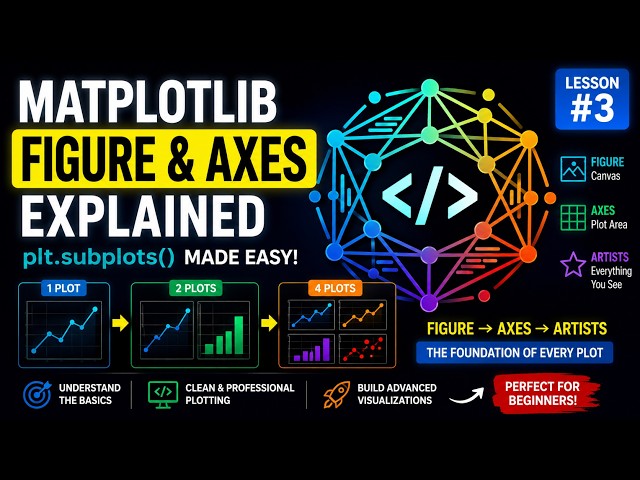
Matplotlib Figure & Axes Explained 📊 - plt.subplots() Made Easy for Beginners -

Welcome to Lesson 3 of our Data Science & Python Visualization Course! In this lesson, you'll learn one of the most important ...

13:57
Matplotlib Figure & Axes Explained 📊 - plt.subplots() Made Easy for Beginners -

57 views

3 weeks ago

EzCode
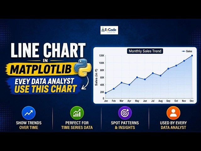
Line Chart in Matplotlib — The ONE Chart Every Data Analyst Must Know!

If you're learning Python for data analysis, this is the first chart you NEED to master the Line Chart in Matplotlib. In this video, we're ...

1:17
Line Chart in Matplotlib — The ONE Chart Every Data Analyst Must Know!

10 views

11 days ago

Learning_Space
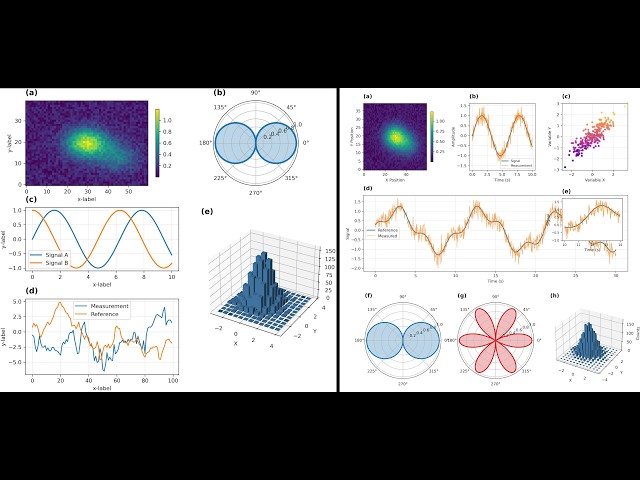
Scientific Figure Layout Designer for Publication-Quality Plots | Merge | subplot2grid | Python

Code Link: https://github.com/LearningSpaceHub/Scientific-Figure-Layout-Designer-for-Publication-Quality-Plots This tool helps ...

2:04
Scientific Figure Layout Designer for Publication-Quality Plots | Merge | subplot2grid | Python

40 views

2 weeks ago

Variablz Academy and Parthiban Kannan | AI & Analytics Expert
Paired Bar Plot | Grouped Bar Plot using Matplotlib - Python Data Visualization Tutorial

In this chapter of our free Matplotlib Full Course (Tamil), we build a grouped (side-by-side) bar chart comparing Men vs Women ...

27:06
Paired Bar Plot | Grouped Bar Plot using Matplotlib - Python Data Visualization Tutorial

32 views

1 day ago

Youth Af and ZeroPrep
Class 12 IP - Data Visualization Matplotlib | INFORMATICS PRACTICES (Code 065) | BOARDS 2026-27

class12 #class12ip #informationpractices Hi everyone, Hope everyone is doing great :) In this video, I have covered - Class: ...

28:31
Class 12 IP - Data Visualization Matplotlib | INFORMATICS PRACTICES (Code 065) | BOARDS 2026-27

299 views

20 hours ago