Upload date
All time
Last hour
Today
This week
This month
This year
Type
All
Video
Channel
Playlist
Movie
Duration
Short (< 4 minutes)
Medium (4-20 minutes)
Long (> 20 minutes)
Sort by
Relevance
Rating
View count
Features
HD
Subtitles/CC
Creative Commons
3D
Live
4K
360°
VR180
HDR
13,634 results
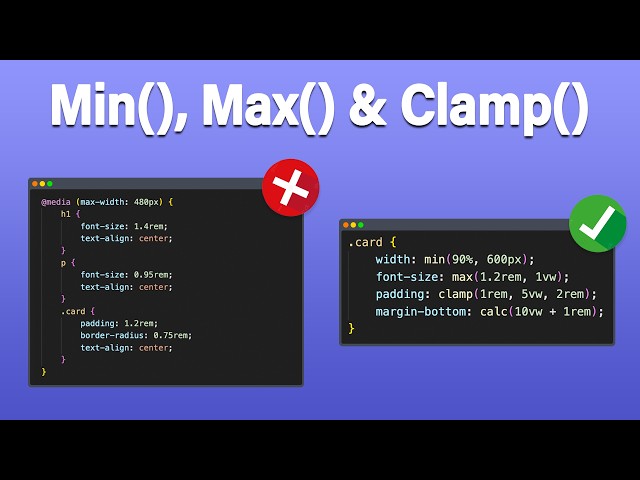
In this video, you'll learn how to use the three most powerful CSS functions for modern responsive design: min(), max() and ...
108,998 views
1 month ago
Learn how to use the CSS clamp function to create responsive and flexible designs without the need for multiple media queries!
19,752 views
1 year ago
In this video, I explain what the CSS clamp() function is, how it works, and why it's a powerful way for responsive design. We'll go ...
1,956 views
5 months ago
Te enseño a usar min(), max() y clamp() de forma supersencilla. Checa mi curso: Mínimo JS para React: ...
2,988 views
2 years ago
CSS has come a long way, but min(), max(), and clamp() make a lot of things a lot easier than they used to be, and really open up ...
315,560 views
5 years ago
🎁 Download the JSON Framework for Bricks Builder for FREE (with video guide) https://heroesdeldiseno.com/clamp/ 👇 Join the #1 ...
942 views
4 months ago
Veamos como hacer las cosas responsive SIN media queries usando funcionas de CSS (si, las hay) Hay muchas funciones en ...
4,338 views
4 years ago
Exploraremos una serie de temas fundamentales en CSS que te ayudarán a mejorar tus habilidades de diseño web. Desde el ...
211,635 views
Te explico las propiedades con las que podemos modificar el contenido del box model Redes sociales: Instagram: ...
1,614 views
Make all your images on your fully responsive website in just 5 lines of code using only HTML and CSS. ▼FOLLOW ME ON MY ...
36,489 views
3 years ago
Become a Member to Support our Channel: https://www.youtube.com/channel/UCGpoeEhUBQBaaKZ_a8HB67Q/join Get our ...
273,579 views
Qué es Flexbox y para qué sirve?, ¿Cómo es la estructura de Flexbox?, ¿Cuál es la propiedad y valor que me permite usar ...
8,336 views
Learn what media queries are and how to use them to create responsive design for mobile devices. 📣 Need hosting and a domain ...
97,290 views
Las media queries nos pueden ayudar mucho pero también añaden complejidad a nuestro código. Te enseñamos como crear ...
192,426 views
Struggling to make your website's headings and text responsive? In this video, I'll show you a simple yet powerful solution: one ...
3,494 views
To create Responsive Typography in your websites, you might immediately want to reach for Media Queries. Well, the clamp ...
9,944 views
Welcome to this in-depth tutorial on Responsive Web Design using CSS functions — specifically min(), max(), clamp(), and calc()!
7,209 views
6 months ago
Conoce nuestras vacantes actuales de tecnología en https://bit.ly/talento-tech-GDI En este vídeo vemos cómo resolver los ...
8,712 views
Today we're going to learn how we can use the CSS clamp function to create responsive, fluid typography! Project Links code: ...
72,790 views
5,355 views
3 months ago
10 MINDBLOWING CSS Tips and Tricks that solve typical JavaScript problems with CSS ONLY. You will learn elegant solutions ...
738,475 views
You can try Divi 5 here: https://bit.ly/3H9S1il Written version of this tutorial: ...
1,503 views
7 months ago
Between December 2019 and April 2020 the browsers all added support for a new method in CSS called clamp( ). This method ...
20,239 views
In this video tutorial, Roger goes over how to implement the Clamp CSS Function to make your website more responsive.
278 views
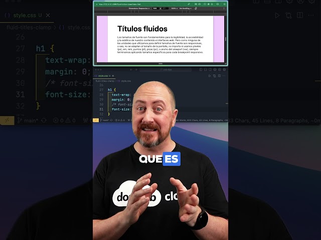
Fluidos con CSS Clamp #programacion #programacionweb #css. Donweb Cloud, Talleres Donweb Cloud, Donweb Cloud ...
874 views
11 months ago
Learn how to use the clamp() method to make resonsive font-sizes in css only Full video: https://youtu.be/2IV08sP9m3U #csstricks ...
38,511 views
Hoy vamos a ver como utilizar la función CSS clamp() para hacer todos nuestros textos responsive. Con esta función ya no nos ...
2,083 views
This video briefly explain about css clamp function. What is required for before using clamp and how to use it. If you are using css ...
390 views